ANALYZING A GRAPH
Many real-world situations can be represented by linear relationships. We can use graphs of linear relationships to visualize situations and solve problems.
Recall that y = mx + b is the slope-intercept form of the equation of a line.
In this form, it is easy to see the slope 'm' and the y-intercept 'b'. So we can use this form to quickly graph a line by plotting the point (0, b) and using the slope to find a second point.
Example 1 :
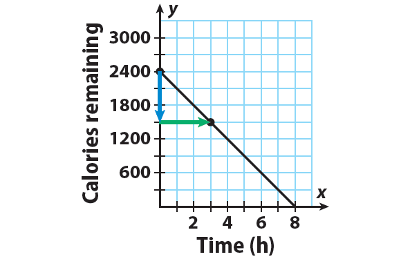
Ken has a weekly goal of burning 2400 calories by taking brisk walks. The equation y = -300x + 2400 represents the number of calories y Ken has left to burn after x hours of walking which burns 300 calories per hour.After how many hours of walking will Ken have 600 calories left to burn ? After how many hours will he reach his weekly goal?
Solution :
Step 1 :
y = -300x + 2400
The y-intercept is b = 2400. Plot the point that contains the y-intercept : (0, 2400).
Step 2 :
Write the slope as a fraction.
m = -300/1 = -600/2 = -900/3
Using the slope as -900/3 helps in drawing a more accurate graph.
The slope is m = -900/3. Use the slope to find second a point. Since the slope = rise / run, from (0, 2400), count down 900 units and right 3 units.
Then, the new point is (3, 1500).
Step 3 :
Draw a line through the points.
Step 4 :
To find after how many hours of walking will Ken have 600 calories left to burn,
Locate 600 calories on the y-axis. Read across and down to the x-axis.
From the graph, we can know that Ken will have 600 calories left to burn after 6 hours.
Step 5 :
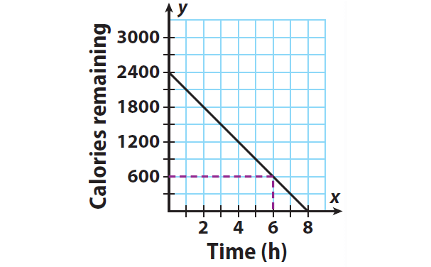
Ken will reach his weekly goal when the number of calories left to burn is 0. Because every point on the x-axis has a y-value of 0, find the point where the line crosses the x-axis.
Ken will reach his goal after 8 hours of brisk walking.
Example 2 :
A roller coaster park is open from May to October each year. The graph shows the number of park visitors over its season.
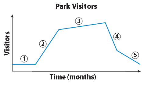
A. Segment 1 shows that attendance during the opening weeks of the park’s season stayed constant. Describe what Segment 2 shows.
A steep upward slope shows that attendance rises quickly.
B. Based on the time frame, give a possible explanation for the change in attendance represented by Segment 2.
The increase might coincide with summer break from school.
C. Which segments of the graph show decreasing attendance? Give a possible explanation.
Segments 4 and 5; the decrease might coincide with the end of summer break when school starts again.
D. Explain how the slope of each segment of the graph is related to whether attendance increases or decreases.
A positive slope shows that attendance increases.
A negative slope shows that attendance decreases.
Kindly mail your feedback to v4formath@gmail.com
We always appreciate your feedback.
©All rights reserved. onlinemath4all.com
Recent Articles
-
AP Calculus AB Problems with Solutions (Part - 13)
Feb 17, 25 11:25 AM
 AP Calculus AB Problems with Solutions (Part - 13)
 -
AP Calculus AB Problems with Solutions (Part - 14)
Feb 17, 25 11:16 AM
AP Calculus AB Problems with Solutions (Part - 14) -
Digital SAT Math Problems and Solutions (Part - 112)
Feb 17, 25 03:53 AM
 Digital SAT Math Problems and Solutions (Part - 112)