CENTER SHAPE AND SPREAD OF A DISTRIBUTION
Center, shape, and spread are all words that describe what a particular graph looks like.
When we talk about center, shape, or spread, we are talking about the distribution of the data, or how the data is spread across the graph.
Center
The center of a distribution gives you exactly what it sounds like. It tells you the center or median of the data.
When you look at a graph, it will be the value where approximately half of your data is on one side and the rest of your data is on the other side.
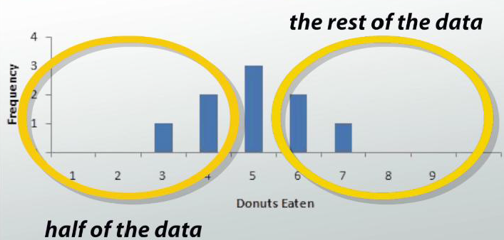
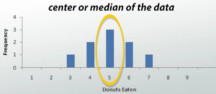
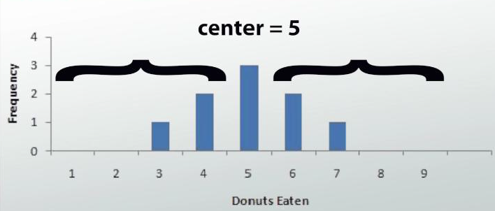
The median point of your data set is the middle number if you were to put your data in ascending order. Let's say we are taking surveys of different groups of people and their donut eating habits. For the first group of people, we have this graph. We see that our center is 5 because half of the people are to the left and the other half are to the right.
Mean vs Median
Another way to describe the center is to take the mean or average of all your data. When you describe your center in terms of mean and median, you might find the the following stuff.
(i) Mean and median might be slightly different.
(ii) Mean might be more or less than median.
(iii) Center ---> If your graph is skewed, then you will want to use the median as your center.
Shape
Depending on the group of people we survey about their donut eating habits, we will get different sets of data. When graphed, we can get different looking graphs.
We use shape to describe the different types of graphs we will see. There are four different ways in which we can describe a graph's shape.
1. Symmetric
2. Unimodal and Bimodal
3. Skewed
4. Uniform
Symmetric
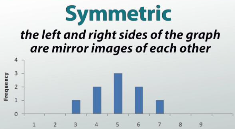
We can say a graph is symmetric if the left and right sides of the graph are mirror images of each other. This graph, for example, is symmetric because the left side is a mirror image of the right side.
Unimodal and Bimodal
Sometimes, our graph will look like a rollercoaster and will have a number of peaks, or areas where the graph is higher than the surrounding areas.
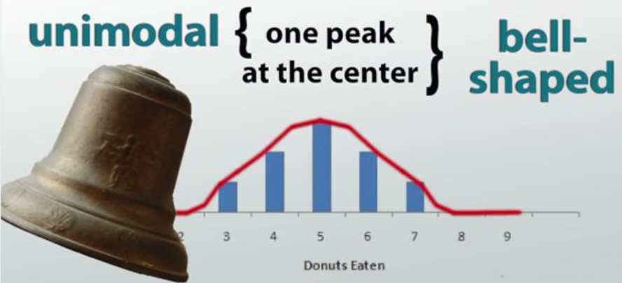
If there is only one peak, then we call it unimodal distribution. If this one peak occurs at the center of the graph, it is also called bell-shaped.
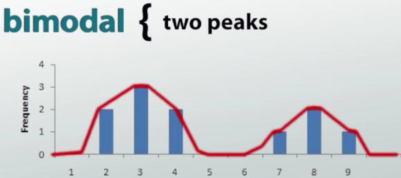
Doesn't this look like a bell? If it has two peaks, then we will call it a bimodal distribution.
Note :
The term “bimodal” alone literally means two modes, and the term “unimodal” alone literally means one mode. When describing the shape, you must use the word distribution after bimodal/unimodal every time.
Skewed
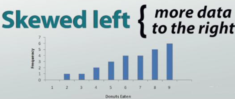
If our graph has more data on one side rather than the other, we call it skewed. If there are more to the right, we call it skewed left.
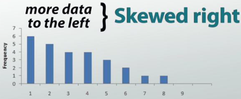
For our donuts eaten survey, this would mean that more people choose to eat more donuts and fewer people choose to eat just a few. If our graph has more data to the left, then we would say that our graph is skewed right.
For our donuts survey, it would mean that more people prefer to eat fewer donuts. A good way to remember this is to view the graph as a slide. If you slide down to the right, then it is skewed right and if you slide down to the left, then it is skewed left.
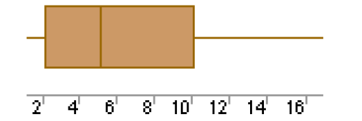
Boxplots often provide information about the shape of a data set. The examples below show some common patterns.
Skewed Right :
Symmetric :
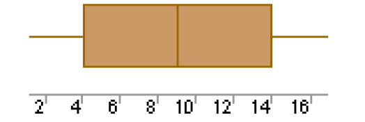
Skewed Left :
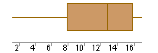
Each of the above boxplots illustrates a different skewness pattern. If most of the observations are concentrated on the low end of the scale, the distribution is skewed right; and vice versa.
If a distribution is symmetric, the observations will be evenly split at the median, as shown above in the middle figure.
Uniform
If our survey of people's donut eating habits showed that for each amount of donuts eaten, the same number of people would choose that amount, then our graph will look flat all across the top, then we call it uniform. A uniform shape has no peaks nor is it skewed.
Spread
A measure of spread, sometimes also called a measure of dispersion, is used to describe the variability in a sample or population. It is usually used in conjunction with a measure of central tendency, such as the mean or median, to provide an overall description of a set of data.
There are many reasons why the measure of the spread of data values is important, but one of the main reasons regards its relationship with measures of central tendency.
A measure of spread gives us an idea of how well the mean, for example, represents the data. If the spread of values in the data set is large, the mean is not as representative of the data as if the spread of data is small. This is because a large spread indicates that there are probably large differences between individual scores. Additionally, in research, it is often seen as positive if there is little variation in each data group.
We will be looking at two measures of spread :
Range and Quartiles
Range
The range is the difference between the highest and lowest scores in a data set and is the simplest measure of spread. So we calculate range as :
Range = maximum value - minimum value
Whilst using the range as a measure of spread is limited, it does set the boundaries of the scores. This can be useful if you are measuring a variable that has either a critical low or high threshold (or both) that should not be crossed. The range will instantly inform you whether at least one value broke these critical thresholds.
In addition, the range can be used to detect any errors when entering data. For example, if you have recorded the age of school children in your study and your range is 7 to 123 years old you know you have made a mistake!
Quartile
Quartiles tell us about the spread of a data set by breaking the data set into quarters, just like the median breaks it in half. Quartiles are a useful measure of spread because they are much less affected by outliers or a skewed data set than mean.
For this reason, quartiles are often reported along with the median as the best choice of measure of spread and central tendency, respectively, when dealing with skewed and/or data with outliers.
Interquartile Range
A common way of expressing quartiles is as an interquartile range. The interquartile range describes the difference between the third quartile (Q3) and the first quartile (Q1), telling us about the range of the middle half of the scores in the distribution.
Interquartile range = Q3 - Q1
Kindly mail your feedback to v4formath@gmail.com
We always appreciate your feedback.
©All rights reserved. onlinemath4all.com
Recent Articles
-
Logarithmic Derivative Problems and Solutions
Apr 16, 25 09:25 PM
Logarithmic Derivative Problems and Solutions -
Digital SAT Math Problems and Solutions (Part - 145)
Apr 16, 25 12:35 PM
 Digital SAT Math Problems and Solutions (Part - 145)
 -
Digital SAT Math Problems and Solutions (Part - 144)
Apr 14, 25 07:27 PM
 Digital SAT Math Problems and Solutions (Part - 144)