COMPARING DATA DISPLAYED IN DOT PLOTS
In this section, we are going to see, how to compare the shape, center, and spread of a data which is displayed in dot plot.
Example 1 :
Numerically compare the dot plots of the number of hours a class of students exercises each week to the number of hours the students play video games each week.
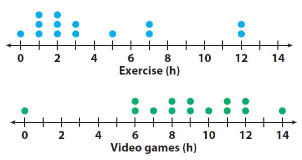
1. Compare the shapes of the dot plots.
The dot plots appear almost opposite. The dot plots show that most students exercise less than 4 hours but most play video games more than
6 hours each week.
2. Compare the centers of the dot plots by finding the medians.
The median number of hours that students exercise is 2.5 hours, which is 6.5 hours less than the median of 9 hours that students play video games.
3. Compare the spreads of the dot plots by calculating the ranges.
The dot plots show the ranges to be similar to one another. The range for the amount of time that students exercise is 12 hours, and the range for the amount of time that students play video games is 14 hours.
4. Calculate the median and range of the data in the dot plot. Then compare the results to the dot plot for exercise.
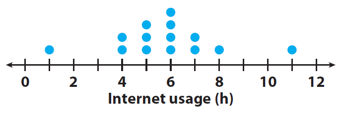
Median: 6 h, range: 10 h ;
If you remove the outliers, the range is 4 hours. The median is greater than the median for exercise. The range is less than exercise.
Example 2 :
The dot plots show the heights of 15 high school basketball players and the heights of 15 high school softball players.
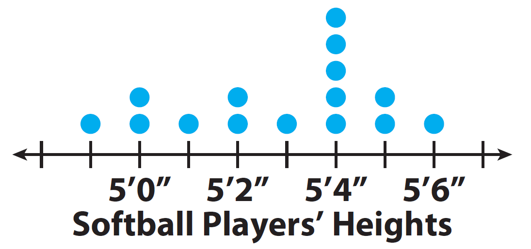
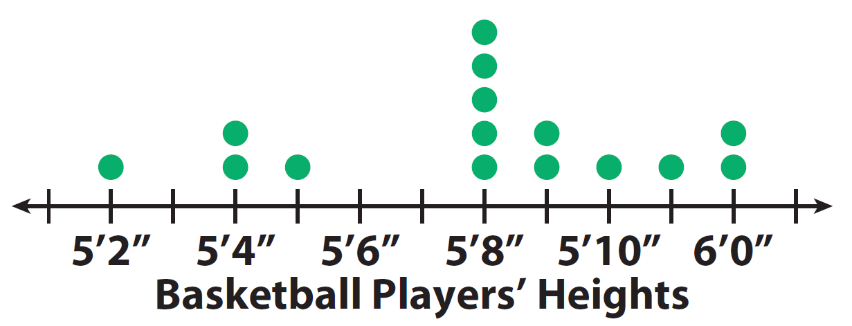
1. Visually compare the shapes of the dot plots.
Softball : All the data is 5’6” or less.
Basketball : Most of the data is 5’8” or greater.
As a group, the softball players are shorter than the basketball players.
2. Visually compare the centers of the dot plots.
Softball : The data is centered around 5’4”.
Basketball : The data is centered around 5’8”.
This means that the most common height for the softball players is 5 feet 4 inches, and for the basketball players 5 feet 8 inches.
3. Visually compare the spreads of the dot plots.
Softball : The spread is from 4’11” to 5’6”.
Basketball : The spread is from 5’2” to 6’0”.
There is a greater spread in heights for the basketball players.
4. Visually compare the dot plot of heights of field hockey players to the dot plots for softball and basketball players.
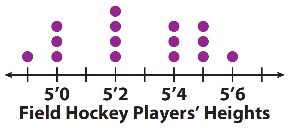
Shape :
Dot plots for field hockey players and softball players have a similar spread.
Center :
Center of the field hockey dot plot is less than the center for softball or basketball players.
Spread :
Dot plots for field hockey players and softball players have a similar spread.
Kindly mail your feedback to v4formath@gmail.com
We always appreciate your feedback.
©All rights reserved. onlinemath4all.com
Recent Articles
-
SAT Math Resources (Videos, Concepts, Worksheets and More)
Sep 26, 24 10:14 AM
SAT Math Resources (Videos, Concepts, Worksheets and More) -
Digital SAT Math Problems and Solutions (Part - 45)
Sep 26, 24 10:12 AM
 Digital SAT Math Problems and Solutions (Part - 45)
 -
Pre Calculus Problems and Solutions (Part - 10)
Sep 25, 24 06:25 AM
 Pre Calculus Problems and Solutions (Part - 10)