COMPARING DOT PLOTS NUMERICALLY
We can compare the shape, center, and spread of two dot plots numerically by calculating values related to the center and spread.
Remember that outliers can affect our calculations.
Example 1 :
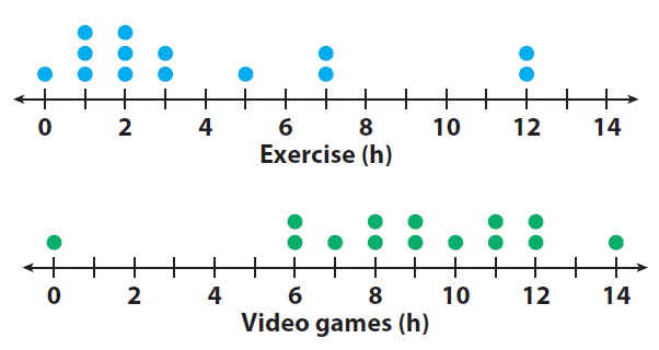
Numerically compare the dot plots of the number of hours a class of students exercises each week to the number of hours the students play video games each week.
1. Compare the shapes of the dot plots.
The dot plots appear almost opposite. The dot plots show that most students exercise less than 4 hours but most play video games more than
6 hours each week.
2. Compare the centers of the dot plots by finding the medians.
The median number of hours that students exercise is 2.5 hours, which is 6.5 hours less than the median of 9 hours that students play video games.
3. Compare the spreads of the dot plots by calculating the ranges.
The dot plots show the ranges to be similar to one another. The range for the amount of time that students exercise is 12 hours, and the range for the amount of time that students play video games is 14 hours.
4. Calculate the median and range of the data in the dot plot. Then compare the results to the dot plot for exercise in Example 1.
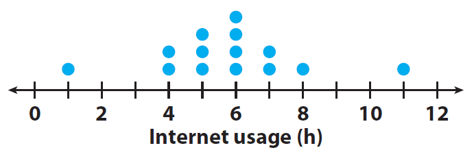
Median: 6 h, range: 10 h ;
If you remove the outliers, the range is 4 hours. The median is greater than the median for exercise. The range is less than exercise.
Example 2 :
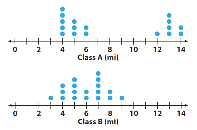
The dot plots show the number of miles run per week for two different classes.
1. Compare the shapes of the dot plots.
Class A : clustered around two areas.
Class B : clustered in the middle
2. Compare the centers of the dot plots.
Class A : two peaks at 4 and 13 mi.
Class B : looks centered around 7 mi
3. Compare the spreads of the dot plots.
Class A : spread from 4 to 14 mi, a wide gap no data.
Class B : spread from 3 to 9 mi
4. Calculate the medians of the dot plots.
The median for both dot plots is 6 miles.
5. Calculate the ranges of the dot plots.
Group A could be children and Group B could be adults.
6. What do the medians and ranges of two dot plots tell you about the data?
The medians allow you to compare the centers. The ranges allow you to compare the spreads.
Kindly mail your feedback to v4formath@gmail.com
We always appreciate your feedback.
©All rights reserved. onlinemath4all.com
Recent Articles
-
Digital SAT Math Problems and Solutions (Part - 144)
Apr 14, 25 07:27 PM
 Digital SAT Math Problems and Solutions (Part - 144)
 -
Quadratic Equation Problems with Solutions (Part - 1)
Apr 14, 25 11:33 AM
Quadratic Equation Problems with Solutions (Part - 1) -
Quadratic Equation Problems with Solutions (Part - 2)
Apr 14, 25 11:22 AM
Quadratic Equation Problems with Solutions (Part - 2)