SCATTER PLOTS AND TREND LINES WORKSHEET
Subscribe to our ▶️ YouTube channel 🔴 for the latest videos, updates, and tips.
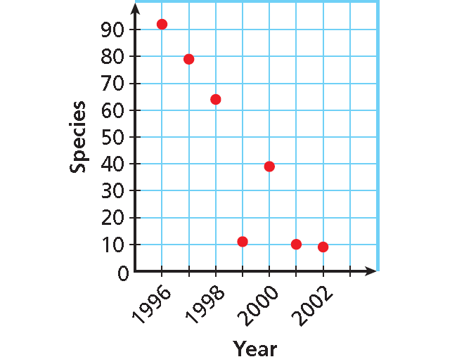
Problem 1 :
The table shows the number of species added to the list of endangered and threatened species in the United States during the given years. Graph a scatter plot using the given data.
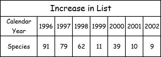
Source: U.S. Fish and Wildlife Service.
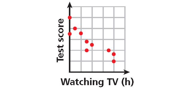
Problem 2 :
Describe the correlation between TV watching and test score illustrated by the scatter plot.
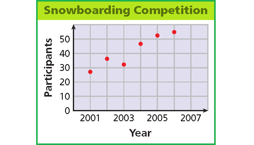
Problem 3 :
Describe the correlation illustrated by the scatter plot.
Problem 4-6 : Identify the correlation you would expect to see between each pair of data sets. Explain.
Problem 4 :
The number of empty seats in a classroom and the number of students seated in the class.
Problem 5 :
The number of pets a person owns and the number of books that person read last year.
Problem 6 :
The monthly rainfall and the depth of water in a reservoir.
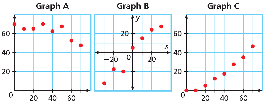
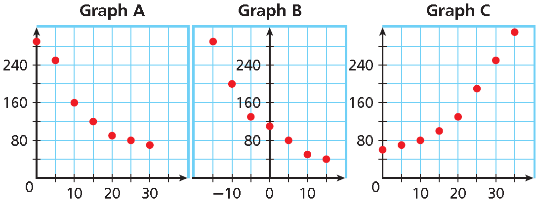
Problem 7 :
Choose the scatter plot that best represents the relationship between the number of days since a sunflower seed was planted and the height of the plant. Explain. The x-value represents time (days) and the y-value represents the height (in.).
Problem 8 :
Choose the scatter plot that best represents the relationship between the number of minutes since a pie has been taken out of the oven and the temperature of the oven. Explain.
Draw a trend line and use it to make a prediction.
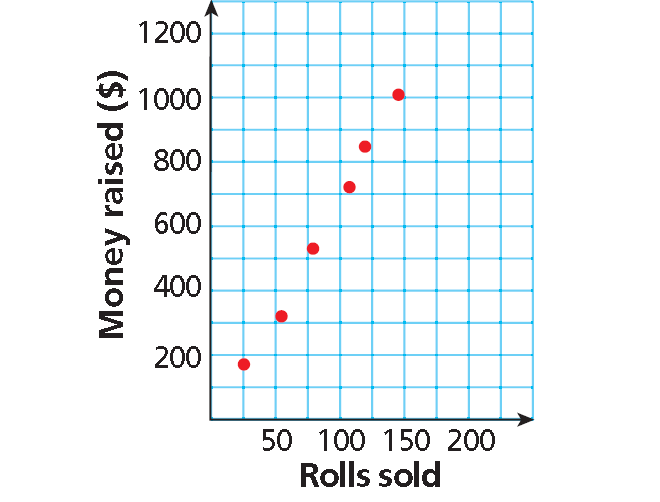
Problem 9 :
The scatter plot shows a relationship between the total amount of money collected and the total number of rolls of wrapping paper sold as a school fund-raiser. Based on this relationship, predict how much money will be collected when 175 rolls have been sold.
Draw a trend line and use it to make a prediction.
Problem 10 :
Based on the trend line in problem 9 above, predict how many wrapping paper rolls need to be sold to raise $500.
Problem 11 :
The scatter plot shows the number of sport utility vehicles sold in a city from 2005 to 2010.
a. In what year were 1000 SUVs sold?
b. About how many SUVs were sold in 2009?
c. Describe the relationship shown by the data.


Detailed Answer Key
1. Answer :
Use the table to make ordered pairs like (1996, 91) for the scatter plot.
The x-value represents the calendar year and the y-value represents the number of species added.
Plot the ordered pairs.
2. Answer :
As the number of hours spent watching TV increased, test scores decreased.
There is a negative correlation between the two data sets.
3. Answer :
As the year increased, number of participants increased.
There is a positive correlation between the two data sets.
4.Answer :
You would expect to see a negative correlation. As the number of students increases, the number of empty seats decreases.
5. Answer :
You would expect to see no correlation. The number of pets a person owns has nothing to do with how many books the person has read.
6. Answer :
You would expect to see a positive correlation. As more rain falls, there is more water in the reservoir.
7. Answer :
Graph A :
There will be a positive correlation between the number of days and the height because the plant will grow each day.
Graph A has a negative correlation, so it is incorrect.
Graph B :
Neither the number of days nor the plant heights can be negative.
Graph B shows negative values, so it is incorrect.
Graph C :
This graph shows all positive coordinates and a positive correlation, so it could represent the data sets.
Graph C is the correct scatter plot.
8. Answer :
Graph A :
It shows that the pie is cooling steadily after it is taken out of the oven, so it is correct.
Graph B :
It shows the pie cooling while it is in the oven, so it is incorrect.
Graph C :
It shows the temperature of the pie is increasing after it is taken out of the oven, so it is incorrect.
9. Answer :
Draw a line that has about the same number of points above and below it. Your line may or may not go through data points.
Find the point on the line whose x-value is 175. The corresponding y-value is 1200.
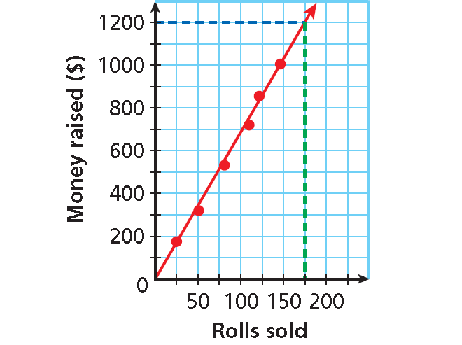
Based on the data, $1200 is a reasonable prediction of how much money will be collected when 175 rolls have been sold.
10. Answer :
Find the point on the line whose
y-value is 500. The corresponding
x-value is about 75.
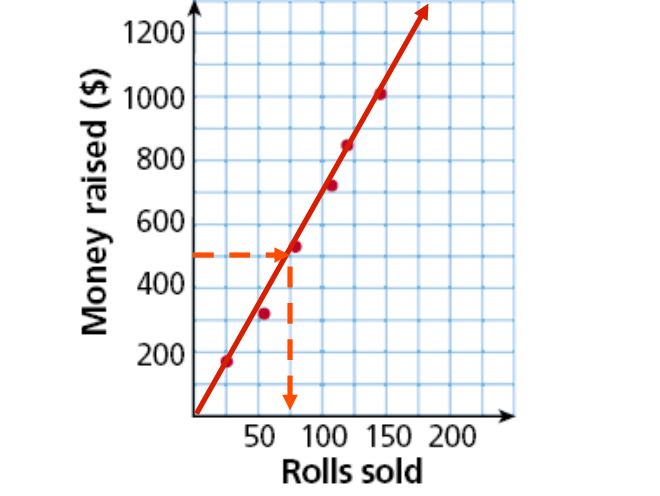
Based on the data, about 75 wrapping paper rolls is a reasonable prediction of how many rolls need to be sold to raise $500.
11. Answer :
a) By drawing the horizontal line at y = 1000, we get x = 2007. From this we understand that at 2007, 1000 SUV sold.
b) By drawing the vertical line at x = 2009, it meets the point in between 800 to 1000. So, in 2009, there are in between 800 to 1000 SUVs sold.
c) While drawing the line of best fit, we get falling line. Observing the ordered pairs, when number of years increases, number of SUVs sold is decreasing. Then it is negative relationship.
Subscribe to our ▶️ YouTube channel 🔴 for the latest videos, updates, and tips.
Kindly mail your feedback to v4formath@gmail.com
We always appreciate your feedback.
About Us | Contact US | Privacy Policy
©All rights reserved. onlinemath4all.com
Recent Articles
-
10 Hard SAT Math Questions (Part - 39)
Dec 11, 25 05:59 PM
10 Hard SAT Math Questions (Part - 39) -
10 Hard SAT Math Questions (Part - 38)
Dec 08, 25 12:12 AM
 10 Hard SAT Math Questions (Part - 38)
 -
SAT Math Practice
Dec 05, 25 04:04 AM
 SAT Math Practice - Different Topics - Concept - Formulas - Example problems with step by step explanation

