DOT PLOTS AND DATA DISTRIBUTION
Subscribe to our ▶️ YouTube channel 🔴 for the latest videos, updates, and tips.
A dot plot is a visual representation of data using intervals or categories of variables; the dots represent an observation in the data.
The data distribution is a listing or function showing all the possible values (or intervals) of the data and how often they occur.
Problem 1:
A baseball team manager records the number of runs scored by the team in each game for several weeks.
1, 3, 1, 7, 2, 0, 11, 2, 2, 3, 1, 3, 4, 2, 2, 4, 5, 2, 6
(i) Make a dot plot to know how the data is distributed.
Solution :
Step 1 :
Make a number line.
Data values range from 0 to 11, so use a scale from 0 to 11.
Step 2 :
Draw a dot above the number line for each data value.
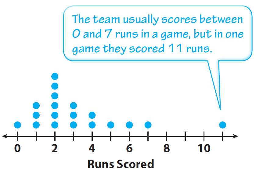
(ii) How many games did the team play during the season? How can you tell from looking at the dot plot?
Solution :
19; there are 19 dots, each of which represents a game.
(iii) At how many games did the team score 2 runs or fewer? How do you know?
Solution :
10 games; I counted the number of dots for the values less than or equal to 2.
Problem 2 :
A different baseball team scores the following numbers of runs in its games for several weeks:
4, 4, 6, 1, 2, 4, 1, 2, 5, 3, 3, 5, 4, 2
(i) Make a dot plot to know how the data is distributed.
Solution :
Step 1 :
Make a number line.
Data values range from 0 to 6, so use a scale from 0 to 6.
Step 2 :
Draw a dot above the number line for each data value.

(ii) Tell how many games the team played, and identify the data value with the greatest frequency.
Solution :
14 games; the value with the greatest frequency is 4;
there were 4 games in which the team scored 4 runs.
Use the data set at the right and the description below to complete Exercises.
Problem 3 :
The class took a survey about how many people live in each students home. The results are shown at the bottom.
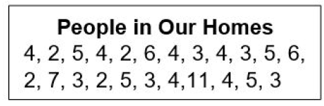
1. Make a dot plot of the data.
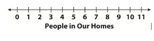
2. Find the mean, median, and range of the data.
mean: _____; median: _____; range: _____
3. Describe the spread, center, and shape of the distribution.
4. Which number is an outlier in the data set? Explain what effect the outlier has on the measures of center and spread.
5. 12 students were surveyed to find how many people live in their homes.
2, 4, 5, 3, 7, 2, 5, 3, 4, 5, 6, 4
Use this data to make a box plot at the right.
Solution :
|
Number of people are living at home 2 3 4 5 6 7 11 |
Frequency 4 5 6 4 2 1 1 |
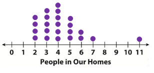
2)
Mean:
2, 2, 2, 2, 3, 3, 3, 3, 3, 4, 4, 4, 4, 4, 4, 5, 5, 5, 5, 6, 6, 7, 11
Mean = Sum of data / Total number of data
= 97/23
= 4.21
Median:
2, 2, 2, 2, 3, 3, 3, 3, 3, 4, 4, 4, 4, 4, 4, 5, 5, 5, 5, 6, 6, 7, 11
Median = 4
Range:
Range = maximum data - minimum data
= 11 - 2
= 9
3) Spread :
Maximum people's home there were 4 people living.
Center :
Center or median = 4.
Shape :
The data is skewed to the right.
4) Outlier is 11.
5)
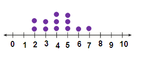
Mean:
2, 2, 3, 3, 4, 4, 4, 5, 5, 5, 6, 7
Mean = sum of data / Total number of data
= 50/12
= 4.16
Median:
2, 2, 3, 3, 4, 4, 4, 5, 5, 5, 6, 7
Number of given data = 12
Median = (12/2)th value + [(12/2) + 1]th value
= (6th value + 7th value)/2
= (4 + 4)/2
= 4
Subscribe to our ▶️ YouTube channel 🔴 for the latest videos, updates, and tips.
Kindly mail your feedback to v4formath@gmail.com
We always appreciate your feedback.
About Us | Contact Us | Privacy Policy
©All rights reserved. onlinemath4all.com

Recent Articles


-
Digital SAT Math Practice Test with Answers (Part - 17)
Sep 24, 26 12:05 PM
 Digital SAT Math Practice Test with Answers (Part - 17)
 -
Digital SAT Math Practice Test with Answers (Part - 16)
Sep 07, 26 11:23 AM
Digital SAT Math Practice Test with Answers (Part - 16) -
Digital SAT Math Practice Test with Answers (Part - 15)
Aug 23, 26 12:24 PM
 Digital SAT Math Practice Test with Answers (Part - 15)

