GROUPING DATA IN INTERVALS
Subscribe to our ▶️ YouTube channel 🔴 for the latest videos, updates, and tips.
Once the data is selected, it has to be presented in a neat and precise manner such that any one can understand.
To present the date in a neat and precise manner, we have to group the data in intervals.
Example 1 :
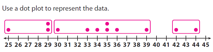
The members of the high-school basketball team practice free throws. Each player attempts 50 free throws. The number of free throws made by each player is listed below.
25, 29, 29, 30, 33, 34, 35, 35, 36, 39, 42, 44
(i) Use a dot plot to represent the data.
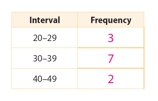
(ii) On your dot plot, circle the dots that are in each interval of the frequency table below. Then complete the frequency table.
(iii) Analyze the data. How were the data collected ? How many data values are there ? What are the mean, median, range, and IQR of the data ?
Solution (i) :
Solution (ii) :
Solution (iii) :
12 players attempted 50 free throws each, and the number of free throws each player made was counted. There are 12 data values. Mean = 34.25 ; median = 34.5 ; range = 19 ; IQR = 6
Example 2 :
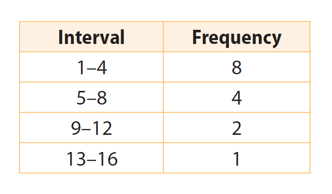
A birdwatcher counts and records the number of birds at a bird feeder every morning at 9:00 for several days.
12, 3, 8, 1, 1, 6, 10, 14, 3, 6, 2, 1, 3, 2, 7
(i) Make a frequency table.
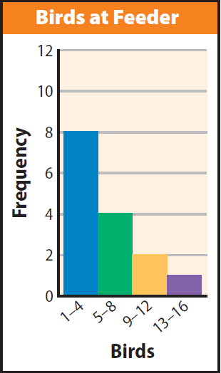
(ii) Use histogram to represent the data.
(iii) Suppose the birdwatcher continues his observation for three more days and collects these new data values: 5, 18, and 2. How could we change the histogram to include the data ?
Solution (i) :
Solution (ii) :
Make a histogram.
The intervals are listed along the horizontal axis. The vertical axis shows the frequencies. For each interval, draw a bar to show the number of days in that interval. The bars should have equal widths. They should touch but not overlap.
Solution (iii) :
Sample answer : Add an interval from 17–20 to show a bar 1 unit high for the new data value of 18. Increase the bar heights for the intervals 1–4 and 5–8 by 1.
Reflect
1. Can you use the dot plot to find the mean and the median of the data ? Can you use the frequency table ? Why or why not ?
Yes; no;
The dot plot shows all the data values, so you can find the median and calculate the mean. The frequency table groups data into intervals, so you can’t see the individual data values.
2. How do you find the number of data values in a data set from a dot plot ? How can you find the number of data values from a frequency table ?
Count the number of dots; find the sum of the frequencies.
Subscribe to our ▶️ YouTube channel 🔴 for the latest videos, updates, and tips.
Kindly mail your feedback to v4formath@gmail.com
We always appreciate your feedback.
About Us | Contact Us | Privacy Policy
©All rights reserved. onlinemath4all.com

Recent Articles
-
AP Calculus AB Problems with Solutions (Part - 1)
May 29, 26 09:41 PM
 AP Calculus AB Problems with Solutions (Part - 1)
 -
SAT Math Practice Problems with Answers
May 21, 26 01:17 AM
 SAT Math Practice Problems with Answers
 -
Digital SAT Math Questions and Answers (Part - 13)
May 17, 26 09:03 AM
 Digital SAT Math Questions and Answers (Part - 13)


