USING A HISTOGRAM
A histogram is a type of bar graph whose bars represent the frequencies of numeric data within intervals.
Example 1 :
A birdwatcher counts and records the number of birds at a bird feeder every morning at 9:00 for several days.
12, 3, 8, 1, 1, 6, 10, 14, 3, 6, 2, 1, 3, 2, 7
(i) Make a frequency table.
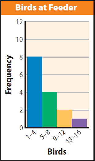
(ii) Use histogram to represent the data.
(iii) Suppose the birdwatcher continues his observation for three more days and collects these new data values: 5, 18, and 2. How could we change the histogram to include the data ?
(iv) Using the histogram, what are some conclusions about the data that can we make from the shape of the distribution?
Solution (i) :
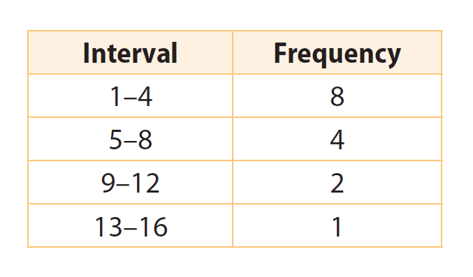
Solution (ii) :
Make a histogram.
The intervals are listed along the horizontal axis. The vertical axis shows the frequencies. For each interval, draw a bar to show the number of days in that interval. The bars should have equal widths. They should touch but not overlap.
Solution (iii) :
Sample answer : Add an interval from 17–20 to show a bar 1 unit high for the new data value of 18. Increase the bar heights for the intervals 1–4 and 5–8 by 1.
Solution (iv) :
The highest bar is for the interval 1–4, which means that on more than half the days (8 out of 15), the birdwatcher saw only 1–4 birds. The bars decrease in height from left to right, showing that it was more likely for the birdwatcher to see a small number of birds rather than a large number on any given day.
Example 2 :
Ed counted the number of seats available in each cafe in his town.
18, 20, 22, 26, 10, 12, 16, 18, 7, 8
(i) Make a frequency table.
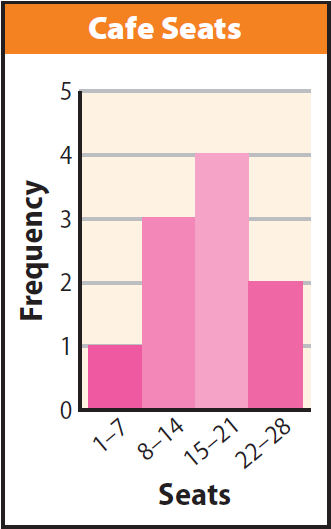
(ii) Use histogram to represent the data.
(iii) What are some conclusions we can make about the distribution of the data ?
(iv) How can we display data in a histogram ?
Solution (i) :
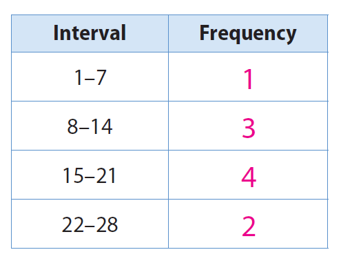
Solution (ii) :
Make a histogram.
The intervals are listed along the horizontal axis. The vertical axis shows the frequencies. For each interval, draw a bar to show the number of seats in that interval. The bars should have equal widths. They should touch but not overlap.
Solution (iii) :
Sample answer: Only one cafe has less than 7 seats available. The bars increase in height until they reach the interval for 15–21 seats, and then they decrease in height, showing that most cafes have 21 or fewer seats.
Solution (iv) :
Order the data from least to greatest. Organize the data in intervals of the same size, and make a bar graph of the frequencies for each interval.
Example 3 :
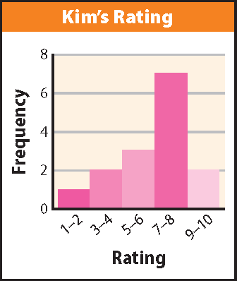
Kim has started rating each movie she sees using a scale of 1 to 10 on an online site. Here are her ratings so far :
6, 9, 8, 5, 7, 4, 8, 8, 3, 7, 8, 7, 5, 1, 10
(i) Make a histogram of the data.
(ii) Use your histogram from Your Turn 4. What are some conclusions you can make about Kim’s movie ratings from the shape of the distribution ?
Solution (i) :
Solution (ii) :
Sample answer: Kim gave ratings of 7 or 8 to 7 of 15 movies. She gave ratings of 9 or 10 to 2 of 15 movies.
Kindly mail your feedback to v4formath@gmail.com
We always appreciate your feedback.
©All rights reserved. onlinemath4all.com
Recent Articles
-
10 Hard SAT Math Questions (Part - 29)
Oct 16, 25 06:04 AM
10 Hard SAT Math Questions (Part - 29) -
10 Hard SAT Math Questions (Part - 28)
Oct 14, 25 10:57 AM
10 Hard SAT Math Questions (Part - 28) -
SAT Math Questions and Answers
Oct 13, 25 01:09 PM
SAT Math Questions and Answers